
Interface Overview
Table of contents
Video of Nozbe Classic Interface
Watch a short video showcasing Nozbe navigation and interface:
Interface Overview
The main concept behind the interface is to provide the app content in 5 columns:
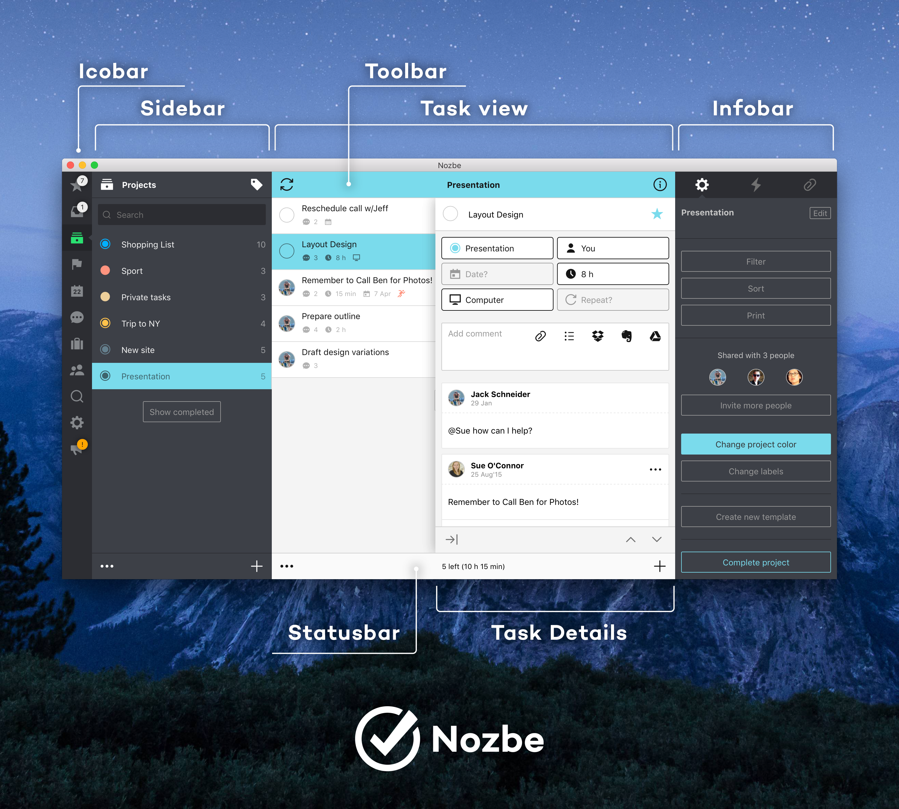
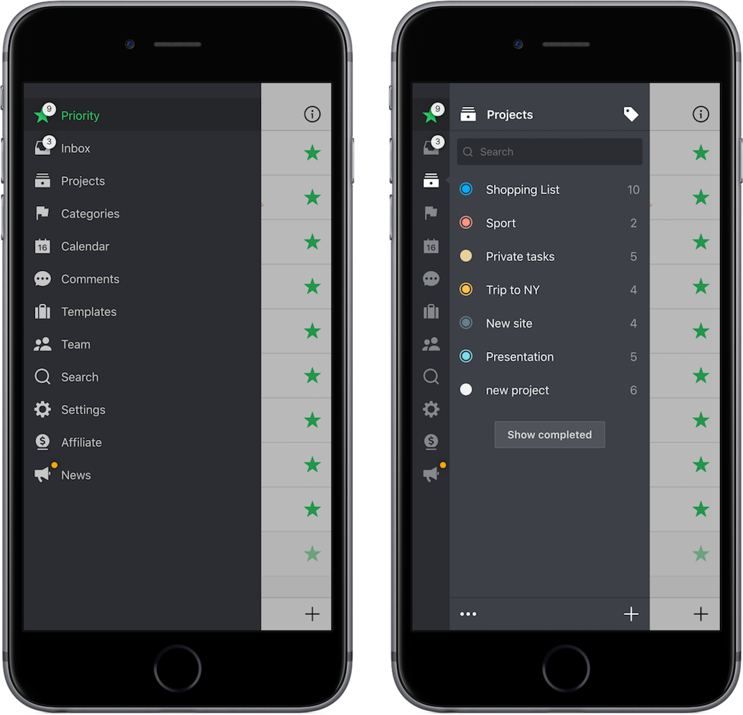
1. Icobar - it is always on the left side, it serves to switch views (inbox, projects, team, settings, etc.) in the app.
2. Sidebar - it shows up as an extension to icobar and serves to select which task list user wants to see. For example tasks:
- from project X
- tasks marked with category X
- tasks due within calendar week X
- tasks assigned to user X
- etc.
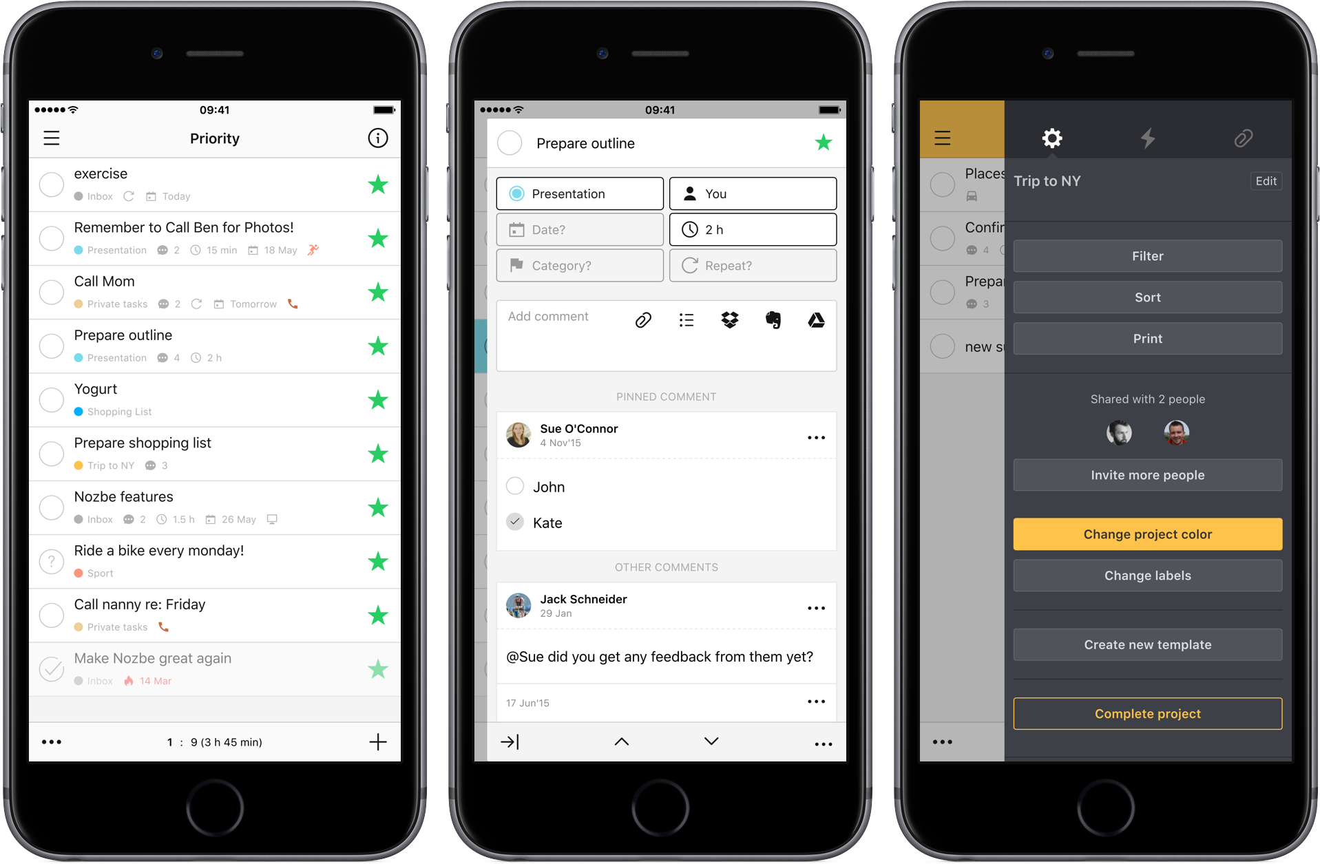
3. Task view - it is the most important view, where users spent most of the time. With its clear design it serves to concentrate on doable stuff to help get more done.
4. Task details - here you can manage all parameters and comment task. It has been designed to roll out from the right edge of Task view and to cover that view up. The concept behind it is to allow the user to focus on a specific task and its contents. Here the user will find everything he or she needs to get the task done.
5. Infobar - it is spliced by tabs that serves to:
- edit parameters of a task list that is currently active in the 3rd column (Task view)
- view the activity log
- manage project attachments
Nozbe also has horizontal user interface elements:
- Toolbar - here you can manually execute sync and open the infobar column
- Status bar - you can switch to edit mode and add elements to an active list here
6. Dark Mode - If you prefer a dark theme, you can switch your Nozbe Classic app to dark mode. To do so, open your settings and click on the “moon” icon. You can also turn it on in the Settings -> General -> Local Settings. Dark mode is available on mobile devices as well.
Responsive design
Nozbe Classic app is fully responsive and it has 3 modes of presenting user interface. It depends from app window width and the rule is applicable on all platforms.
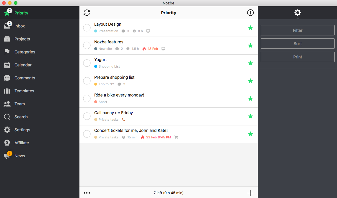
- Desktop mode
This mode is active when app window width is higher than 1023 pixels. In this mode you can see all the 5 columns at one view. It can be run on desktop machines but also on iPad in landscape mode.
Desktop mode on OS X
Desktop mode on iPad
- Hybrid mode
This mode is active when app window width is between 735 and 1023 pixels. You can always see at least 2 columns in this mode. It has been specially designed for iPhone 6 Plus landscape mode but it also works on iPad portrait mode and some Android smartphones and tablets. It is great solution for reviewing your projects on mobile devices. You can also use it on your desktop, just decrease Nozbe window width.
Hybrid mode on OS X
Hybrid mode on iPhone 6 Plus:
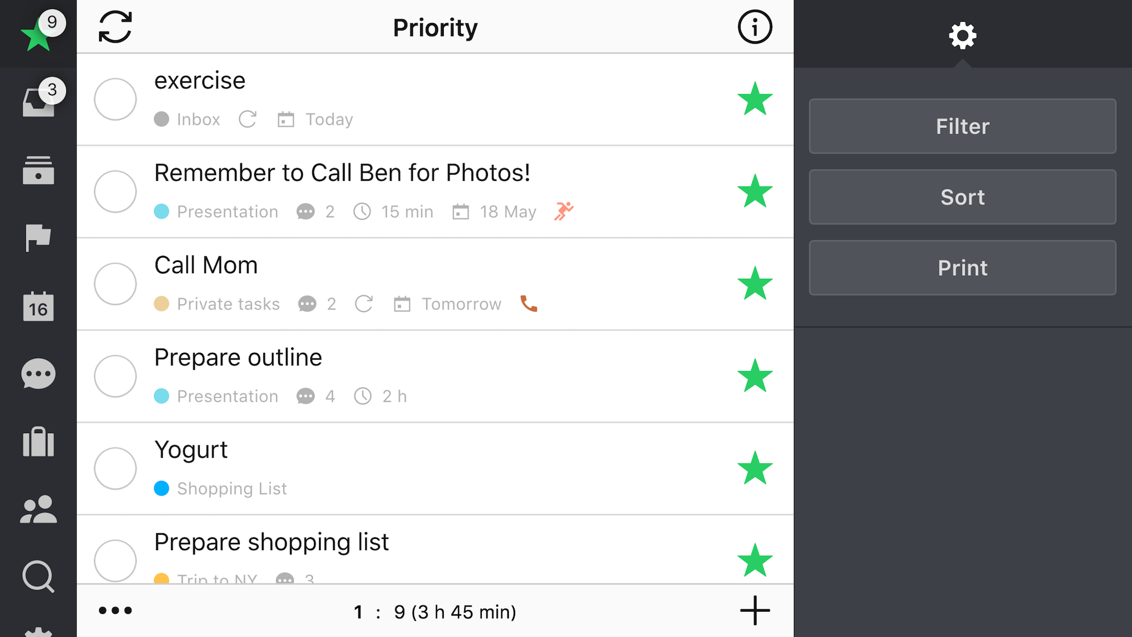
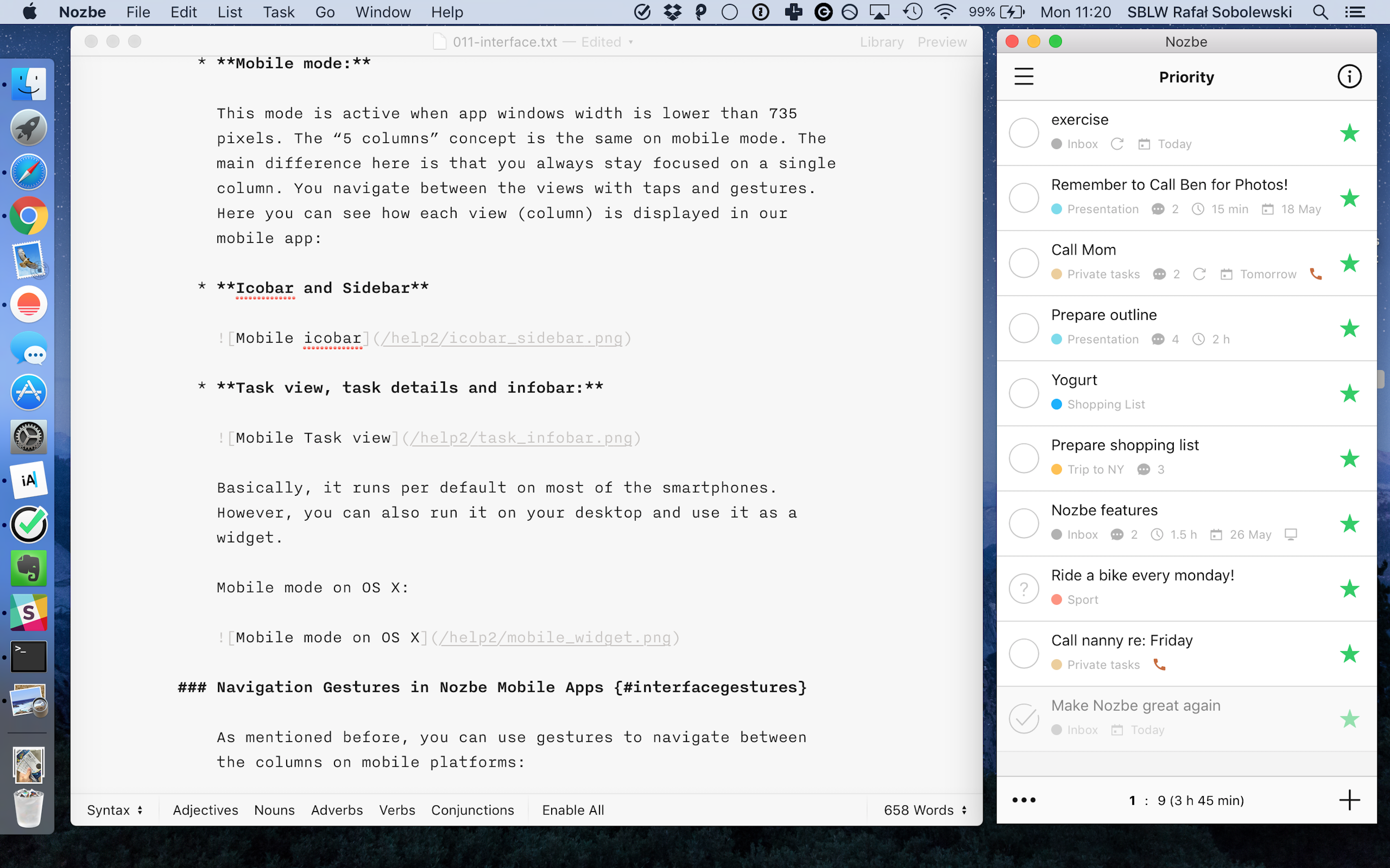
- Mobile mode
This mode is active when app windows width is lower than 735 pixels. The “5 columns” concept is the same on mobile mode. The main difference here is that you always stay focused on a single column. You navigate between the views with taps and gestures. Here you can see how each view (column) is displayed in our mobile app:
- Icobar and Sidebar
- Task view, task details and infobar:
Basically, it runs per default on most of the smartphones. However, you can also run it on your desktop and use it as a widget.
Mobile mode on OS X


